5 Rules for an Event Design Color Palette
Your event color palette is one of the most important visual stimuli to enhance the live experience. What are the rules of color and how can you use it to your best advantage?
The color palette in combination with the set, staging, lighting design, props and other elements that make up the experience need to be in harmony. But where do you start when considering the color palette used in your event design?
I’ve attended events where the color palette has enhanced both the overall look and feel of the event as well as venue fixtures, fittings and general décor. I’ve also seen some very strange and discombobulated palettes too. In this post we highlight ways in which you can explore a color palette to suit the event objectives, the venue and the time – day or night - of the event.
Color Basics
To start a quick revision of color will provide you with a basis on which to make some creative choices. Primary colors are red, yellow, and blue. They cannot be created by combining two other colors. On the other hand, secondary colors, are the colors of green, purple, orange that are formed by combining primary colors. Tertiary colors are created by mixing a primary color with a secondary color. The diagram below provides an easy way to visualise this.
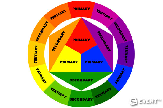
To get with the color jargon let's explain what a ‘hue’ is. We can ‘tint’ or lighten a color by adding white to it or ‘tone’ it down by adding both black and white to it; or shade the color by the addition of black. As we tint, tone or shade we are creating a color family, headed by the original primary color. Look at it as a color family tree.
Now we can see where various colors comes from, we can start to look at some of the ways in which color works when put side by side in the décor for your event and how that color palette can inform the lighting design you use.
Colors and Emotions
Colors can create an emotional response from people. Exploring color and emotion is an established research area. The table below summarises some of the primary and secondary colors and emotional responses to those colors. So when you are creating your event color palette you may want to take emotional responses into account.
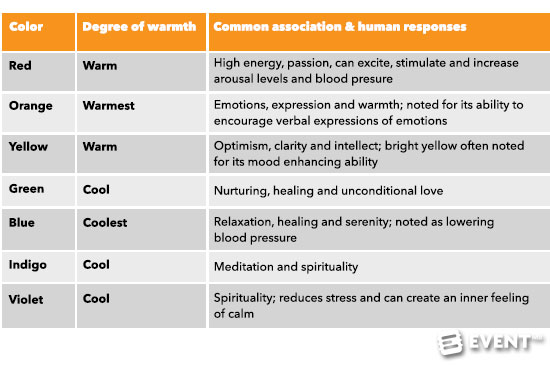
Color Table: Source Lovelock & Wirtz (2007)
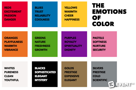
Image Credit: MMI Creative
Always Start with the Venue
When you’re figuring out how to design your color palette you need to remember that we perceive colors in the context in which we see them. Looking at colors side by side and in the context of a venue is the starting point. For example, the venue may have a strong color palette in terms of its wall colors, fixtures and fittings. Some venues have very ‘loud’ curtains and some have neutral colors. It’s always a good idea to record the venue backdrop color palette as a point of reference to inform your design decisions.
Remember that the same color will look very different in the context of other colors – some compliment and some contrast. The graphic below illustrates how the same color is affected in different ways by the other color surrounding it. You have to decide what suits the venue backdrop as well as the design palette you think is going to create a wow event. This can be done by looking at ways in which you see your palette, based on color combining rules, that includes the question - do I want a contrasting or complementary color palette?
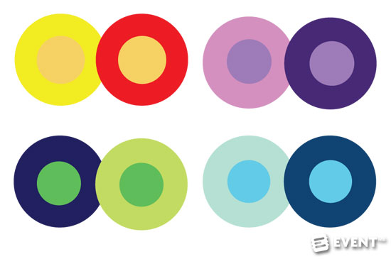
Image credit: Hubspot
Rule 1: Analogous Color Palettes
These are formed by pairing one main color with the two colors directly next to it on the color wheel. This scheme type of three colors creates a soft and less contrasting palette. It can be complemented by adding two additional colors, which are found next to the two outside colors in the wheel for a five color palette. Using one of the main colors of the venue will ensure that the palette complements the venue whilst offering softer complementary colors in the décor. For example, in a white walled venue you may want to use blue, blue-violet and turquoise as well as tints of white to create a joined up palette. This palette creates emotions of relaxation, nurturing and healing.

Image Credit: Smashing Magazine
Rule 2: Monochromatic Color Palette
A monochromatic palette is based on various shades and tints of one hue. Whilst there are no colors that contrast, using this type of palette creates a clean look. For example, it’s a night time event and you decide that you would like to drape the venue in star cloth. You can use a monochromatic palette to compliment the backdrop by adding shades and tints of a contrasting color, say red, to create a clean look. The palette also creates emotions of passion and energy. In this example, your lighting scheme can compliment this look or you can decide to use contrasting colors in the lighting design. This is about personal tastes as well as what your client may think is going to look best.
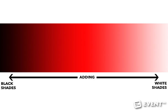
Image Credit: Taylor Takes a Taste
Rule 3: Triadic Color Palette
If you are looking for a high contrast color palette consider a triadic color scheme. It offers high contrasting color but retains the same tone. To start you should choose three colors that are equally placed around the color wheel. However, there is a cautionary note here. This kind of scheme can be overpowering sometimes, depending on the volume of how much of the colors you use. For example, if you have a wood panelled room and you decide to use this scheme, make sure that the color palette is used for items that are not very large and that won't take away from the color base of the walls. You may also subdue the palette by using one dominant color and that compliments the venue coloring and then add in the other two colors sparingly or tint them so that they are softer. Also consider the emotions attached to the palette. Looking at the emotion diagram, what colors do you think will signify the emotions you want your attendees to feel?
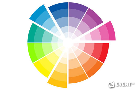
Image Credit: PileofFabric.com
Rule 4: Complementary Color Palette
This color palette is based on using opposite colors of the color wheel. It provides the greatest amount of color contrast so you should consider using one of them as the dominant color. It's bold and can sometimes look overbearing. However, you can also incorporate tints of the same colors to tone down the look. For example, you can use tints and shades from the same color in larger amounts, say with table cloths at an sit down dinner or a stage set that is designed with tints from the same color family.
In the example below, let's assume the venue walls are being draped in black. This ensures that the background for your lighting and decor schemes is using black to contrast all the other colors you use. You further contrast the palette by using two opposites in the color wheel - blue and yellow and tints of those colors - including mixing some of the yellow and blue to get a complimentary green introduced into the palette. A mixed palette like this may look great but what are the emotional triggers of the palette? In this case we are talking about trust, discovery, growth, enlightenment and warmth.
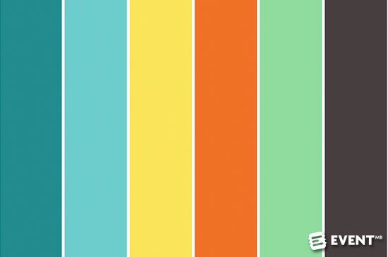
Image Credit: Colour Combos
Rule 5: Split Complementary Color Palette
In this palette one dominant color and the two colors directly adjacent to the dominant color complement each other. This is a more complex and more nuanced color palette than the complementary palette. However, it retains the benefits of the contrast palette. Depending on the venue as a backdrop, the palette can be difficult to balance as the contracts may be overbearing. Consider using one of the dominant colors in the venue color palette. If you are designing with a white blank canvas venue then, consider using tints rather than tones so that you grade the color palette toward the white walls. This palette is probably the most difficult to read in terms of emotion as we have color contrast. However, the contrasting colors have their own emotional characteristics so make sure that you are happy with the emotional triggers you provide.
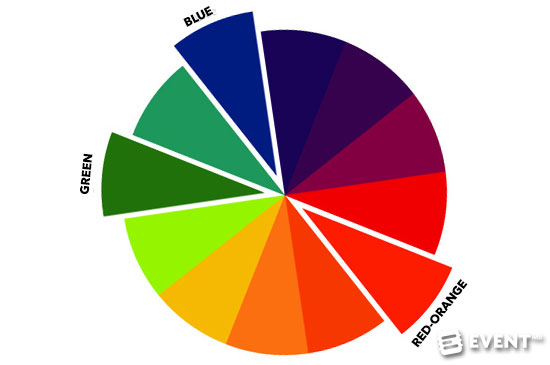
Image Credit: jenib320 on Flickr
In Conclusion
Creating a color palette may seem easy when looking at the rules. However, creating a palette that lends itself to the venue and creates that wow factor through the different hues, tints and tones you use for the drapes, furnishings, props and other decorative elements needs careful consideration. Always think about the emotional triggers that are related to the palette you are designing. Using a mood board to try out the palette is always a good idea.
White blank canvas or black blank canvas venues are easier to work with but if you don’t have this kind of venue for your event, then make sure that the color palette of the venue is incorporated into your décor palette so that overbearing color contrasts are not going to look like the Pick and Mix counter at the sweet store.