21 Great Examples of Venue Websites
Websites are a fantastic opportunity for an event venue to show off its true potential. As well as great design they have to be informative, seamless and user friendly. Here are 21 top global event venue websites.
As an event planner venue websites can often be a let down. In fact a bad website is often listed as one of the top peeves event planners have with venues. As a minimum a venue website should show off the venue, its uniqueness and flexibility, as well as practical details such as capacity and layout information. Some venue websites even go an extra step to inspire eventprofs and help us to do our job better.
Here are some notable websites, for worldwide venues, big and small, and the reasons that make them great.
Mirage, Las Vegas, USA
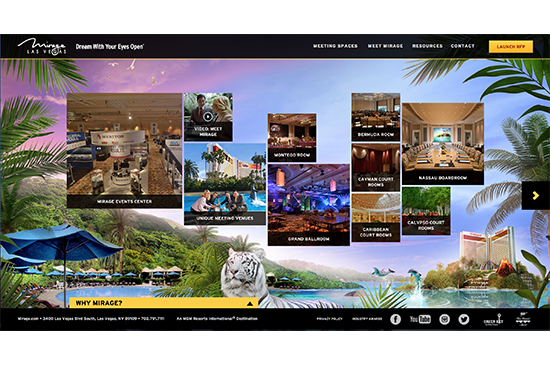
Presenting an interesting and quirky website menu, this site is not only visually appealing, it also offers plenty of substance to back it up. Virtual tours, a comprehensive resource section, a full branding and sponsorship guide, production information and business services can all be accessed via the site.
Tin Roof Barn, White Salmon, Washington, USA
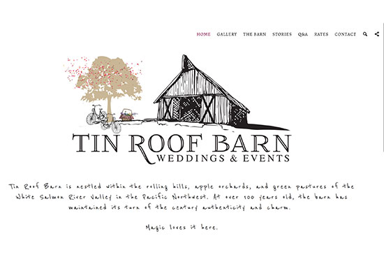
The Tin Roof Barn is more than 100 years old and the venue’s website is refreshingly simple with beautiful illustrations. You won’t find any fancy features and virtual tools here, but rather hand-drawn doodles and a stunning hand drawn map of the area. The real life stories from those that have held their event or wedding there add to the authenticity. Sometimes simplicity is the way to go!
The Egg, Brussels, Belgium
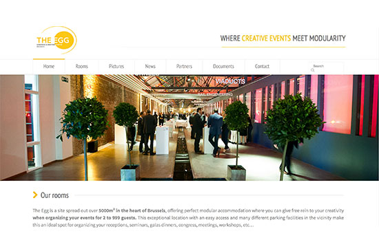
The Egg is a 5,000 sqm congress and meeting center located in the heart of Brussels. Their website clearly shows the potential of the venue with lots of pictures showing how versatile the spaces are. The document zone offers essential information event planners should have at hand when planning an event at the Egg, such as floor plans, technical plans (in PDF and .dwg formats), network connections and furniture options.
By Peter and Pauls, Ontario, Canada
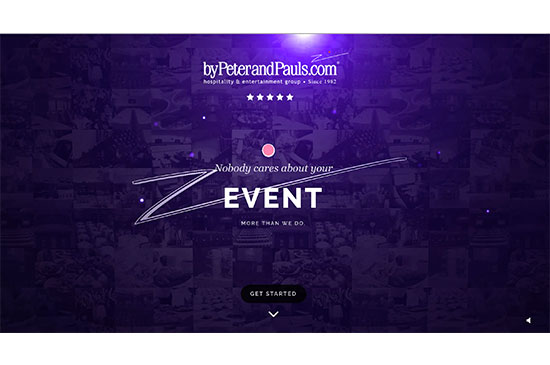
By Peter and Pauls manage 8 event venues in Ontario, Canada, and their website offers a good reflection of their philosophy. The design is sleek and entertaining, and for each venue there is a photo and video gallery, clear floorplans, room capacity charts, 3D tours of the space and a special corporate event section.
There is a great welcome montage to the site with Go Pro style footage welcoming you as a guest to their venue which conveys the excitement of an event from difference perspectives. This is a great use of video integration and including time lapse footage and a birds eye view of one of the properties. Their slogan is "Nobody cares about your event more than we do" and the website really puts this ethos across.
Emirates Stadium, London, UK
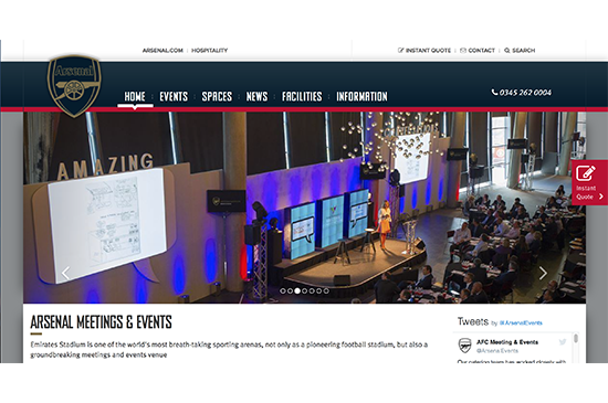
Offering an awesome 360 degree virtual tour and interactive map with changing views, taking into account match days, this is a football stadium where events mean business. The 3D floorplans show various room layouts and configurations to make best use of the spaces, also showing at a glance where the pillars and plug sockets are located, as well as detailed packages and rates. After viewing a floorplan in 3D a 2-dimensional plan will never be the same!
Bespoke, San Francisco, USA
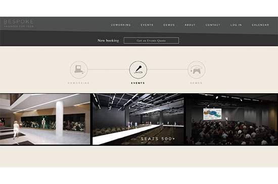
Bespoke is a recently established event venue in San Francisco and is, in its own words, “tailored for tech”. Featuring a co-working space, a demo zone for pop-ups and ups and an event venue, the website is minimalist but interactive: the virtual tour of the space is seamless, and options and services are clearly labelled and priced. No bad surprises here!
RAI Amsterdam, Netherlands
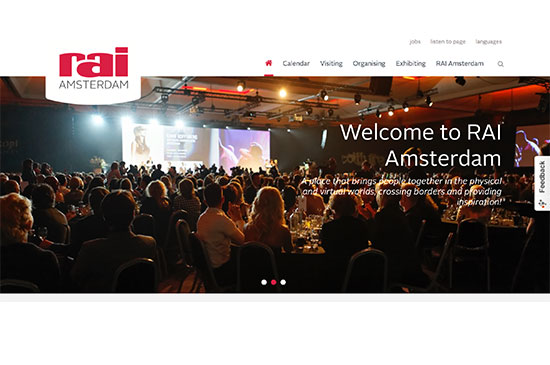
The largest convention center in the Netherlands and, as you would expect, the RAI website is very informative, functional and user friendly for event professionals. There is a specific section for each participant type, whether visitor, exhibitor or organizer and plenty of content such as trend reports. It strongly showcases forthcoming events at the venue, which will be appreciated by anyone organizing public events there.
The list of services available to event planners and exhibitors is very detailed and informative. Most noticeably, the RAI has developed an virtual tour iPad app, which is fully reactive when clients evolve within the event space, allowing for a completely immersive experience. Read more about this in this post about venues embracing innovation.
One Great George Street, London, UK
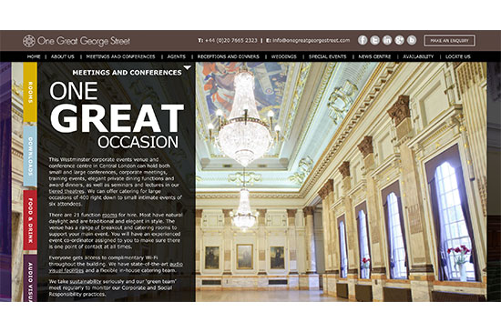
The One Great George Street website is specifically designed for event professionals and it is very easy to find the right information in no time. What stands out in particular are that the room plans make it easy to view precise location, even over different floors, with clear diagrams. This sounds simple but for many venues working out the distance between rooms, particularly if on different levels, can be tricky. Accessibility, the environment and corporate social responsibility are important to this venue and it is possible to download a s a zip file the information you need, such as the CSR policy and media or logos for the venue.
International Convention Centre Sydney, Australia
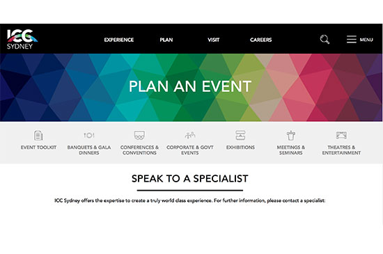
With what feels like an app design, the ICC Sydney website is user friendly and straight to the point, which makes it easy to imagine planning an event there.
By selecting the event type the website tailors the content it serves up to you so you are not lost in irrelevant details, pictures and information that doesn’t match what you are looking for. It even highlights who specifically on the venue team you should contact to make an enquiry for the event type you are looking to host.
The Apartment @ The Hoxton, London, UK
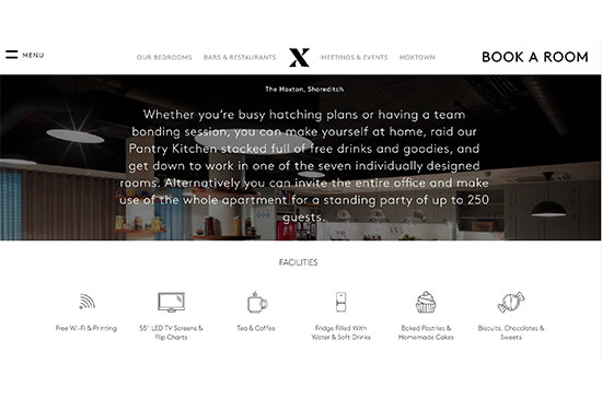
The Apartment is a designated event space within The Hoxton Hotel in Shoreditch, London, and its website is as sleek as its venue design. Each room in the venue is carefully detailed with capacity charts and clear drawings and there are no superfluous details.
This is a quirky venue and the website conveys this character and out of the ordinary offering. Great pictures throughout the site make you feel right at home.
Disneyland Paris Business Solutions, France
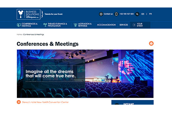
From renting a small meeting room to a private hire of the entire park, this website has everything to make organizing events at Disneyland an event planner’s dream. Each available service is extensively detailed, priced, and illustrated by charts or videos, including a team building activity catalogue. The most interesting feature though remains the “Imagine Your Event” section, where you can completely tailor your event according to your goals and needs. Heart the ideas you like the most, highlighting an ideas board of inspiration for your event.
Melbourne Convention and Exhibition Centre, Australia
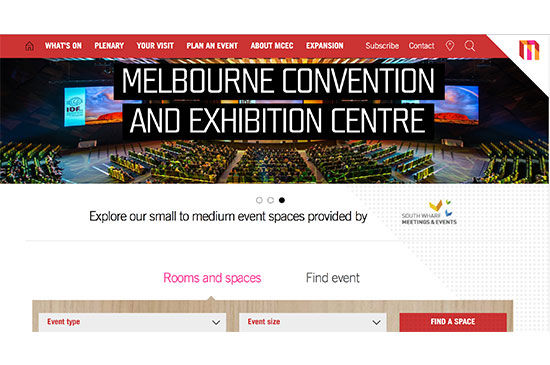
The design of the MCEC website is enjoyable and uncluttered for the event organizer. The website will pinpoint the exact rooms that can match the event format and numbers you enter into the website (e.g. conference and exhibition for less than 500 people).
It features an very interesting section dedicated to technology (and you know how much we love #eventtech around here!). From event planning tools, manuals and guidance to digital signage, social media integration and live streaming, it seems that the MCEC has everything in order to help organizers deliver exceptional events.
San Diego Convention Center, USA
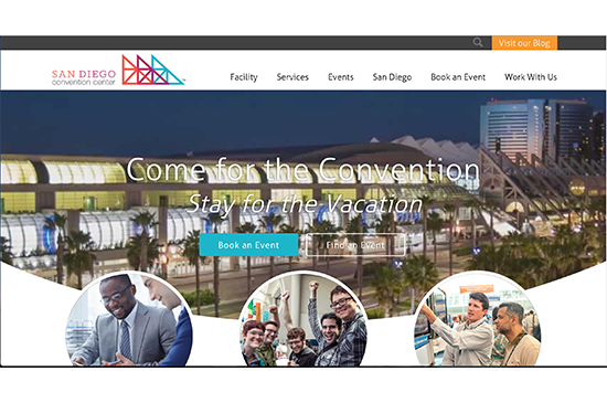
This website isn't text heavy but offers plenty of information across different pages, and sections, accessed via menus and tags at the top of the page. There is a comprehensive local suppliers index, interactive maps and virtual tours, and a full pricing guide. The detailed information, such as loading instructions are downloaded as PDFs from the site.
JW Marriott Hotel Hanoi, Vietnam
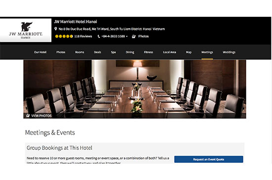
The meetings section of the JW Marriott Hotel Hanoi features clear floor plans and capacity charts. Nothing groundbreaking there I hear you say. 'Meetings Imagined' is the interesting part though. It offers an ideas board for event planners with Polaroid style photos of specific elements, big and small. This shows what can and has been done in this specific venue. Like a Pinterest board specifically for this hotel it can offer inspiration for novice or experienced event planners.
An attendee booking tool keeps the organizers updated and a tailored meetings services app has been designed too.
Royal Caribbean Cruises
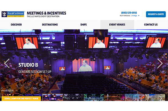
Talk about unusual venues! The Royal Caribbean Cruises website enables you to find a ship that meets your dates, destinations and meeting capacities. It brings to life the possibilities of organizing an event at sea, on board one of their ships. With impressive technology options and a guide dedicated to full event customization, it is clear that Royal Caribbean Cruises have made hosting events a priority.
Sage Gateshead, UK
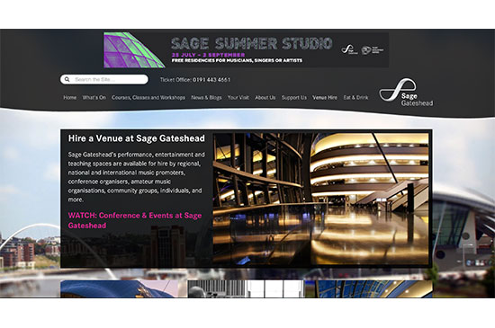
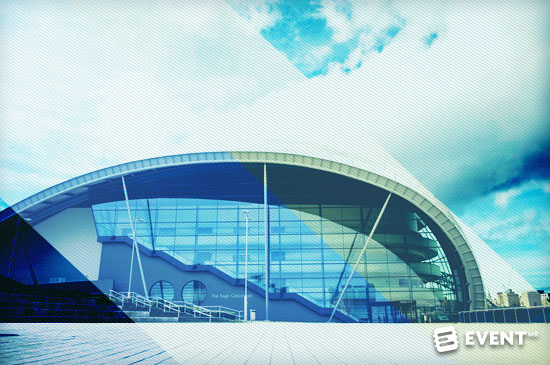
Primarily a music venue, Sage Gateshead takes advantage of its central location and large armadillo structure to host events and meetings, as well as shows and concerts. The description of each event space is clearly detailed, complete with virtual tours powered by Google and presentation videos. It is easy to navigate around the website and we also like the fact that it is fully responsive (absolutely essential).
Hotel Phillips, Kansas City, USA
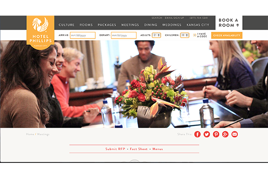
With a simple but stylish design the culture and art deco style of the venue comes across through the website, right down to the artist in residence. The venue offers an online RFP form to encourage planners to submit their event details and find the best fit for their type of event.
CCD Convention Centre Dublin, Ireland
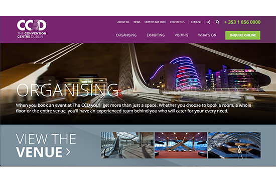
As the world’s first carbon-neutral constructed convention centre the venue's commitment to the environment continues and event planners can calculate their event carbon footprint through a cool calculator on the website. With clear presentation and website design, visitors can also find an interactive map of Dublin to explore the city outside of the venue. There are a good selection of case studies and the website can also be viewed in multiple languages, without having to rely on Google Translate.
Bella Centre, Copenhagen, Denmark
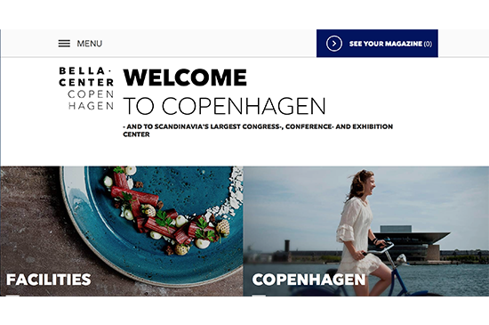
With an impactive, refreshing design, this is the ultimate in cool. The square picture snapshots of the home page turn into panoramic images throughout the other sections of the site. An unusual feature is that the website allows you to add interesting content from the site to create “My Magazine”. This personalized guide can then be saved and exported as a PDF.
Georgia Tech, Atlanta, USA
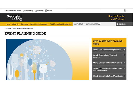
The Georgia Institute of Technology, based in Atlanta, offers a variety of venues and spaces across the university to cater for events of all shapes and sizes. Their website walks the user through the event planning process with lots of tips to get more out of the occasion, whether the user is a new or experienced event planner. Useful features include a comprehensive event planning guide, event design tips, protocol checklists, downloadable templates and forms.
World Forum, The Hague, Netherlands
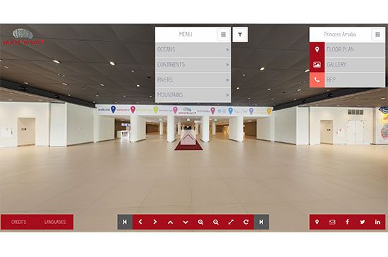
The World Forum in the Hague, Netherlands is a leading international congress center. Offering a state-of-the-art virtual venue tour of the rooms it allows you to rotate 360 degrees and use Google Map style arrows to move to next vantage point or room.
In Conclusion
These 21 worldwide venue websites all have something special to offer event planners. Whether it is cutting edge design, comprehensive information, lashings of inspiration or templates to make your life a little easier, each should be applauded.
Today, venues can’t just offer event planners some basic, fuzzy details and a web contact form. Time is precious and we need precise information to be at our fingertips 24 hours a day. A venue website needs to give an immediate idea of whether your event can fit and what can potentially be achieved within the venue. Capacities for different configurations, plans and pictures are expected as an absolute minimum from serious event venues. Videos and virtual tours are also being increasingly demanded.
In your mind what are the essentials for venue websites? What are your biggest loves and frustrations when trawling through venues online?
