This post looks at how investing in an impacts on the perception of the gig.
Needless to say that your event website is a key focus of your mix. The days of brochureware are distant. The modern attendee learns about what you have to offer, connects with other attendees and ultimately buys the ticket on your website.
Dear reader, sticking a Facebook logo on your website does not make it cool. There are events that are setting the standard. There are design companies that are raising the bar. If you don’t know where to start we suggest having a look at Event Manager Theme, our WordPress Event Theme.
Don’t believe me? Well, my friend, I got 10 examples for your consideration.
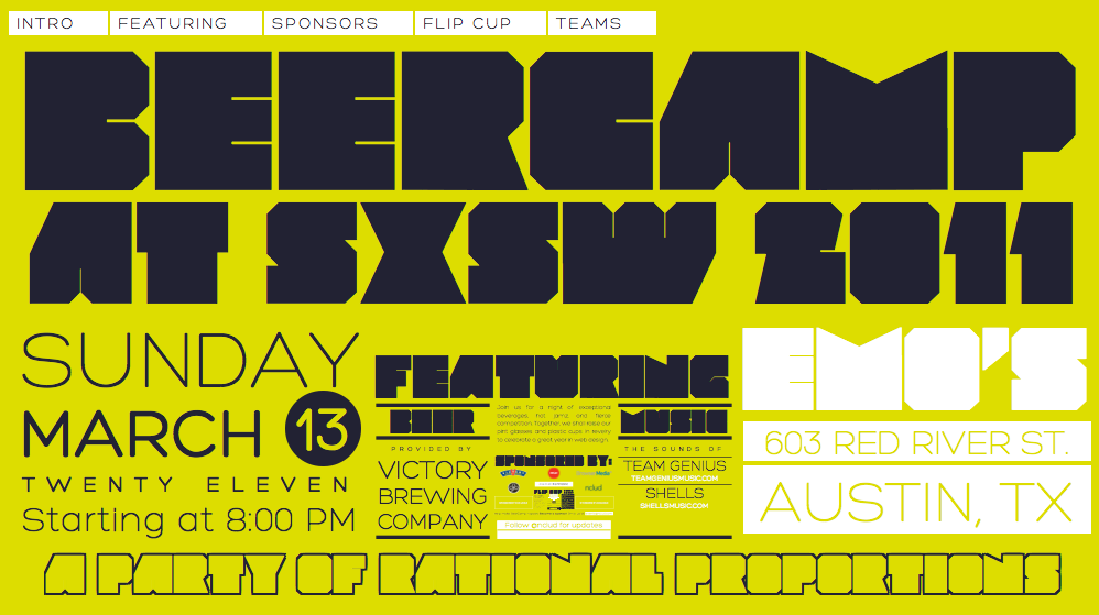
10. Beercamp – Outstanding Web Design
No secret I am a big fan of BarCamps. Nclud created a great experience that does the job, it’s shareable and enjoyable. Make sure you have your volume up while you scroll through it.
9. The Next Web – Quality Blog
I guess that this is an example where the blog surpasses the event. Don’t get me wrong TNW is a great event and all, but the blog has become a fantastic source of news and an international content network. I strongly suggest subscription.
8. TED – Video
TED is the most accessible, invite-only conference known to man. Attending TED is a privilege, but its content is freely available for all to enjoy. This is usually the kind of content you’d dream for. Real quality and value.
7. 4sqDay – Virtual/Aggregation
KISS website focused on social and location. The best way to aggregate events in a virtual environment. I guess I can officially invent the word ‘meta-event’ to describe the above and happenings such as Twestival, Meetups, Tweetups, etc.
6. Google I/O – Countdown
While researching this post, I noticed that countdowns are indeed a popular practice. There is lameness in the way you can display excitement. Not the case of Google events where the same creativity of Doodles is applied to a simple concept.
5. dConstruct – Speaker Focus
When speakers is the primary reason to attend your events you want to put them on the spot. The way DConstruct did it in 2010 is particularly remarkable in its simplicity and organic deployment. Me like!
4. Launch – Call to Action
Register now my friend. It’s all about converting. The guys at Launch understood it quite well. The call to action is incredibly well integrated in the whole design and really tempts clicking. Because you can look as nice as you wish but converting is your objective.
3. Chirp – Quirky Design
I am a big fan of Carsonified. They design great events and event websites. There is great attention to details and the UX is a pleasure for the eye.
2. Coachella – Webcast
4 Million Likes on Facebook. They should have done something right. I love the prominence of virtual attendance and inclusiveness. Ben fatto.
1. Sundance Film Festival
There is an obvious reason why I chose these guys as no1. I believe that video is revolutionising the way we consume events. I get asked all the times by greedy event directors how to monetize video. Well here is how you should do it. Networked content at its best

